
How to start with Framer using Sketch
When it comes to showing the transition, interaction and animation of elements in the user interface an interactive design tool like Framer can make a difference in the way you communicate your vision to the team & stakeholders and boost your efficiency as a designer.

There is a new version of Framer called Framer X. You can check the tutorial How To Start Using Sketch And Framer X.
Introduction
You don’t need to be good at coding to use Framer. If you were used to ActionScript or are familiar with JavaScript you may learn CoffeeScript (language that is used in Framer Classic) as fast as you like. You can ease your process by using Sketch to create and position the elements of the UI and go to Framer only to create the animation and interactivity between layers.
So pretend you’ve designed this UI and you want the developer to build some fancy animations when interacting with some elements of the interface.

You had thought of the next interaction:
When scrolling, the header should remain sticky at the top of the page and reduce its size. When clicking the Floating Action Button (FAB) at the bottom right of the page a navigation bar is displayed and the content on the left should be resized. Also, when clicking the FAB the menu icon within the button should be replaced with a close icon.
Some questions that developers might arise when reading this brief:
What timing do the animations have? What type of animation? Linear, easy-in, custom bezier curves or spring animations?
How much should be the header reduced? What property do you want to reduce? Width, height, only height?
How is the navigation bar displayed? Is it from the top right? From the bottom right?
Do the buttons have a hover state? What do they look like? Is any pressed state?
In this tutorial, we will take the above design screen as an example to build the interaction with some elements of the interface using Sketch and Framer. To get started, you will need the following:
Design screen: I modified one of the screens of Velocity UI kit designed by inVision.
The final interaction should look like this:

Let’s start by creating your first project in Framer and importing a Sketch file.
Create your first project in Framer and import the Sketch file
To create a project in Framer, click File > New. Then, save your file. Framer automatically generates a folder where you have all resources and files of your project.
Next, create a new Sketch file with a circle. Framer needs at least one layer group in the Sketch file in order to show the element, so create a group in Sketch with the layer containing the circle on it. Name it as Circle.

Then, save the file and give it the name mysketchdesignfile. After that, open Framer. Click Code tab which is the second tab at the top of the interface. To import your Sketch file, click on Import which is at the bottom left of the interface. You get Sketch as first option. Click Import.

If you don’t see your Sketch file is probably because is closed. In order to see it, just open your Sketch file, go back to Framer and click Import again.
Once this is done, Framer creates automatically a var called ‘sketch’ which contains the Sketch file.
# Import file "mydesignsketchfile"
sketch = Framer.Importer.load("imported/mydesignsketchfile@1x", scale: 1)
This line is very helpful as it let us to call our layers from Sketch by adding the name of the var before the name of the layer. So, for example, we can change the size of the circle by adding ‘sketch’ before its name.
sketch.circle.size = 100
Note: Every layer has a default width and height of 100, so if you don’t see any difference with the previous code, change the size of the circle to 200.
In the next section, I will explain how to change the canvas size, the background colour and the size and position of elements in the interface.
Change the canvas size, background color, size, and position of elements
Canvas size
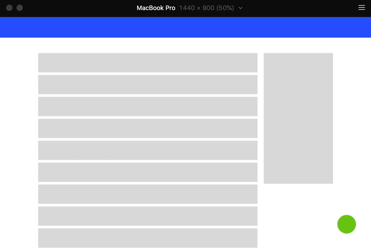
By default the size of the canvas is 512x641. To change the canvas size click on the dropdown and choose Apple MacBook > MacBook Pro.

Background color
Now, we will change the background colour of the canvas. To do so, we will declare a var called bg and create a new backgroundLayer. We will define the backgroundColor using the keyword ‘white’.
bg = new BackgroundLayer
    backgroundColor: "white"
If you prefer, you can also define the colour by using rgb and hex values. Try it yourself. Replace ‘white’ with the hex value ‘172D7F’. The end result should be looking like this:

Position elements
Next, we will position the circle by changing its x and y properties. Write the following:
sketch.circle.x = 100
sketch.circle.y =100
What if you want to center the circle in the canvas? Just write the next code:
sketch.circle.center()
You can also want to center the circle only in x. Remove the last line of code and write:
sketch.circle.centerX()
Your interface now should be looking like this:

Import an artboard from Sketch and add Global Layers
Go to your Sketch file and create an artboard, 1440x900px, call it Artboard. Add the circle to the artboard. Then, import the file into Framer again. As you can see for yourself, you get the artboard with the background color it has in Sketch.

First thing we will do is to change the colour of the background.
sketch.Artboard.backgroundColor = "172D7F"
The result should be the same as in the previous step.
Note: If you want to get this view with the MacBook Pro, in Framer, click View > Preview > Present.
To avoid having to type always sketch before the name of layers, add the next line just below # Import file "mydesignsketchfile":
Utils.globalLayers(sketch)
Now, remove sketch in all lines of the code. Make sure your code matches the source file.
Create basic shapes to build the interaction
Now that we set up the Framer file, we will work on the UI design. First, identify the elements that need to be animated. I have identified the following elements:
Header
Floating Action Button (FAB)
Navigation bar (Menu)
Content

To start, we need to be able to scroll through the content.
Scroll through the content and avoid horizontal scrolling
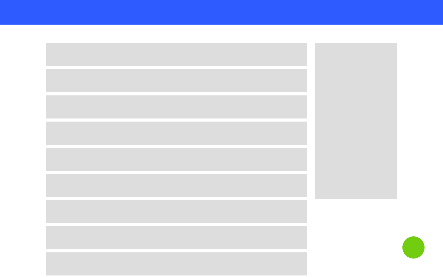
Go to Sketch and create the basic shapes of the UI. Give them the next properties:
Header: Full-width rectangle, a height of 80px.
Floating Action Button: Circle of 72x72px. Position it 60px from the bottom right of the artboard.
Content: 14 rectangles of 849x75px each with a margin in between of 10px.
Filter box: Rectangle of 268x507px with a margin-left of 24px from the content.
Your artboard should look like this:
Note: You can download the Sketch file template if you like.
Next, create a group in Sketch with all the layers in your design and call it my_content.

Import the Sketch file into Framer. Then, add the next line to your project in Framer:
# Wrap the imported content layers
scroll = ScrollComponent.wrap(my_content)
Check the result.

As you scroll the pages moves vertically, but also horizontally. We only want the vertical scroll. Add this line to avoid horizontal scrolling:
# Horizontal scroll to false
scroll.scrollHorizontal = false
In the next section, I will explain how to make the header and FAB fixed.
Make sure your code matches the source file.
Fixed elements
Now, you want the header to be sticky at the top when you scroll through the page and the FAB to remain fixed on its position.
Go to Sketch and create a group with the rectangle of the header and other group with the circle of the FAB. Take the layer groups out of my_content.

Go to Framer and import the Sketch file. Check the result. As you can see, the header and FAB remains fixed while scrolling through the page.

Resize header when scrolling
Now, we want to reduce the height of the header when scrolling through the page.

In Framer, we need to define that on move (scrolling), if ‘y’ position is above the height of the header (meaning, above 80px), change its height to 40px. Or else, return to the original height of the header. Write the next:
# On Move, scale header
scroll.on Events.Move, (offset) ->
    yOffset = -offset.y

    if yOffset > header.height
        header.height = 40

    else
        header.height = 80
We are using a couple of options here:
yOffset var: Contains offset.y that returns the position in y of a layer.
Scroll var: Contains the scrollableComponent with my_content group.
Events.Move: Indicates that a layer is moving.
The result should be like this, but the transition is a bit sharp. Let’s improve it.

We can animate the scale property of the header to get a subtler transition. Also, we can add some animation options such as time and set up a duration for the transition.
# On Move, scale header
scroll.on Events.Move, (offset) ->
    yOffset = -offset.y

    if yOffset > header.height
        header.animate
            scale: 0.9
            options:
                time: 0.05

    else
        header.animate
            scale: 1
            options:
                time: 0.05

Now, we have improved the transition, but there is a white space at the top of the screen. To avoid this, we need to set up the origin in y axis.
#Default states
header.originY = 0
If you realize, the header is scaling in width and height, but we only want the height to be reduced. Replace scale property with scaleY.
# On Move, scale header
scroll.on Events.Move, (offset) ->
    yOffset = -offset.y

    if yOffset > header.height
        header.animate
            scaleY: 0.9
            options:
                time: 0.05

    else
        header.animate
            scaleY: 1
            options:
                time: 0.05
Check that your code matches the source file.
FAB States
Next, we want to define 2 states for the FAB: default and pressed. Duplicate the green circle in Sketch and change the colour of the new one to a darker green. Name the buttons as to open_menu_button and close_menu_button.

Import the Sketch file into Framer. So when clicking, we need to hide the open button (green circle) and show the close button (dark green circle).
By default, the close_menu_button should be hidden. To do so, add this line into your Default states section.
#Default states
close_menu_button.visible = false
By clicking the open_menu_button will show the close_menu_button and hide the open_menu_button.
#FAB interaction
open_menu_button.on Events.Click, (event, layer) ->
    open_menu_button.visible = false
    close_menu_button.visible = true
We have to do the opposite when clicking again on the button:
close_menu_button.on Events.Click, (event, layer) ->
    open_menu_button.visible = true
    close_menu_button.visible = false
The result of the above code is the next:

We can improve the interaction using the scale property. Replace the close_menu_button.visible = false by close_menu_button.scale = 0 in the Default states and write the following:
open_menu_button.on Events.Click, (event, layer) ->
    open_menu_button.animate
        scale: 0
        options:
            time: 0.2
    close_menu_button.animate
        scale: 1
        options:
            time: 0.2

close_menu_button.on Events.Click, (event, layer) ->
    close_menu_button.animate
        scale: 0
        options:
            time: 0.2
    open_menu_button.animate
        scale: 1
        options:
            time: 0.2
Check that it works as following:

We will add now a hover state. Basically, we want to scale a bit the FAB button when hovering it. The final result should look like this:

We will make use of the states in Framer and switch between them. In the Framer documentation you can see what a state is:
States are stored sets of layer properties with values. You can animate states, switch instantly or cycle between them.
So we will define 2 states for each of the buttons and we will work with the scale of the button and the animation options. We will add the Spring curve as the type of animation. By using this type of animation we can not set up a duration. Check the Framer documentation:
You can define the duration of an animation, except when using spring curves.
# FAB Button States
open_menu_button.states.stateA =
    scale: 0.9
    options:
        curve: Spring(damping: 0.5)

open_menu_button.states.stateB =
    scale: 1
    options:
        curve: Spring(damping: 0.5)

close_menu_button.states.stateA =
    scale: 0.9
    options:
        curve: Spring(damping: 0.5)

close_menu_button.states.stateB =
    scale: 1
    options:
        curve: Spring(damping: 0.5)
Next, create your event using MouseOver and MouseOut to simulate the hover effect. You need also to specify that the animation only happens if the scale of the button is < 1.
# On hover, open_menu_button scale
open_menu_button.onMouseOver ->
    if close_menu_button.scale < 1
        open_menu_button.stateCycle("stateA", "stateB")

open_menu_button.onMouseOut ->
    if close_menu_button.scale < 1
        open_menu_button.stateCycle("stateA", "stateB")

# On hover, close_menu_button scale
close_menu_button.onMouseOver ->
    if open_menu_button.scale < 1
        close_menu_button.stateCycle("stateA", "stateB")

close_menu_button.onMouseOut ->
    if open_menu_button.scale < 1
        close_menu_button.stateCycle("stateA", "stateB")
Your code at the moment should match this source code.
Open menu when clicking FAB
In this section, we will work on the animation of the right menu. When clicking on the FAB, the menu should be displayed from right to left.
Do the following. Go to Sketch and create a rectangle 82x392px. Position it in the coordinates: x: 1360, y: 140. After doing that, create a group containing the rectangle and give it the name menu. Leave the menu out of the my_content group.

Next, go to Framer. To hide the menu by default, add the next line of code to your Default states section:
menu.visible = false
Now, we need to show the menu when clicking the FAB. Add menu.visible = true to the FAB interaction event:
And when clicking the button again, so when clicking close_menu_button:
menu.visible = false

We will improve the animation working with the x property. Remove the lines menu.visible = false.
We will give the menu a dynamic position in x. In this way, if you change the width of the menu in Sketch you will not have to change it in Framer.
menu.x = Artboard.width + menu.width
Also, in the FAB interaction event, below the open_menu_button event, add the next animation. Do the same in the close_menu_button event, but this time set up the x to artboard - menu width.
menu.animate
        x: Artboard.width - menu.width
        options:
            time: 0.5

Your code should match this.
Resize layout when the menu is displayed
Next, we want to reduce the scale of the my_content layout when the menu is displayed.

Go to Framer and add this line of code inside your open menu event:
#FAB interaction
    my_content.animate
        scale: 0.9
        options:
            time:0.5
            delay: 0.1
Add the reverse animation inside your close menu event.
my_content.animate
        scale: 1
        options:
            time:0.5
            delay: 0.1
The result should be like this:

The scale is reduced to the center of my_content. We want to have it reduced from the top left. Define the origin of x and y to 0 in the Default states section.
my_content.originX = 0
my_content.originY = 0

In the next section, we will add the UI design. Check that your code matches the source file.
Add the final layout
As layout, we will make use of the Freebie Velocity UI kit created by inVision. I’ve designed a new design screen using some of the components of this UI kit. You can download the Sketch file.
To give the animation to this UI, just paste each of the layer groups of the UI into the groups you have created in your mydesignsketchfile. Once you’ve finished, import the Sketch file again into Framer and check the result.
In the end, you should end up having this animation.

Takeaways
You don’t need a high-level knowledge of coding to build animations in Framer.
There are multiple ways to build the same animation in Framer. Just pick the one you find easier.
To speed up the process, use Sketch to create the elements of the UI and later on, then build your animations in Framer.
List the elements you need to animate before starting to code.
Naming is crucial when working with Framer in order to identify the layers you want to animate.
Start by working with basic shapes, whereas you build the animation in Framer.
Work step by step in each interaction and add elements as you need them.